GM Safety View V2
Designing a data visualization platform that helps transportation planners turn connected vehicle data into life-saving roadway insights.
Company
General Motors (Full Time Employee)
Service
UI/UX Design
Year
2024


The Challenge
GM Safety View V2 is a data visualization platform designed to help transportation planners transform connected vehicle data into actionable roadway insights. The challenge was to move beyond reactive crash reporting toward a proactive, predictive safety model. Myself along with some amazingly talented visionaries designed a GIS-based dashboard that bridges the gap between raw CSV datasets and the critical decision-making needs of Department of Transportation (DOT) analysts.
The User : From Data to Decision
Data is only as valuable as its usability. By defining a clear User Profile, we ensured the interface met the high-stakes requirements of government agencies responsible for public infrastructure.
Role: Civil Engineers and DOT (Department of Transportation) Analysts.
Goal: To identify high-risk corridors and justify infrastructure spend (e.g., new traffic signals or bike lanes).
Pain Point: Not being able to take proactive measures to prevent severe road incidents

Strategic Execution
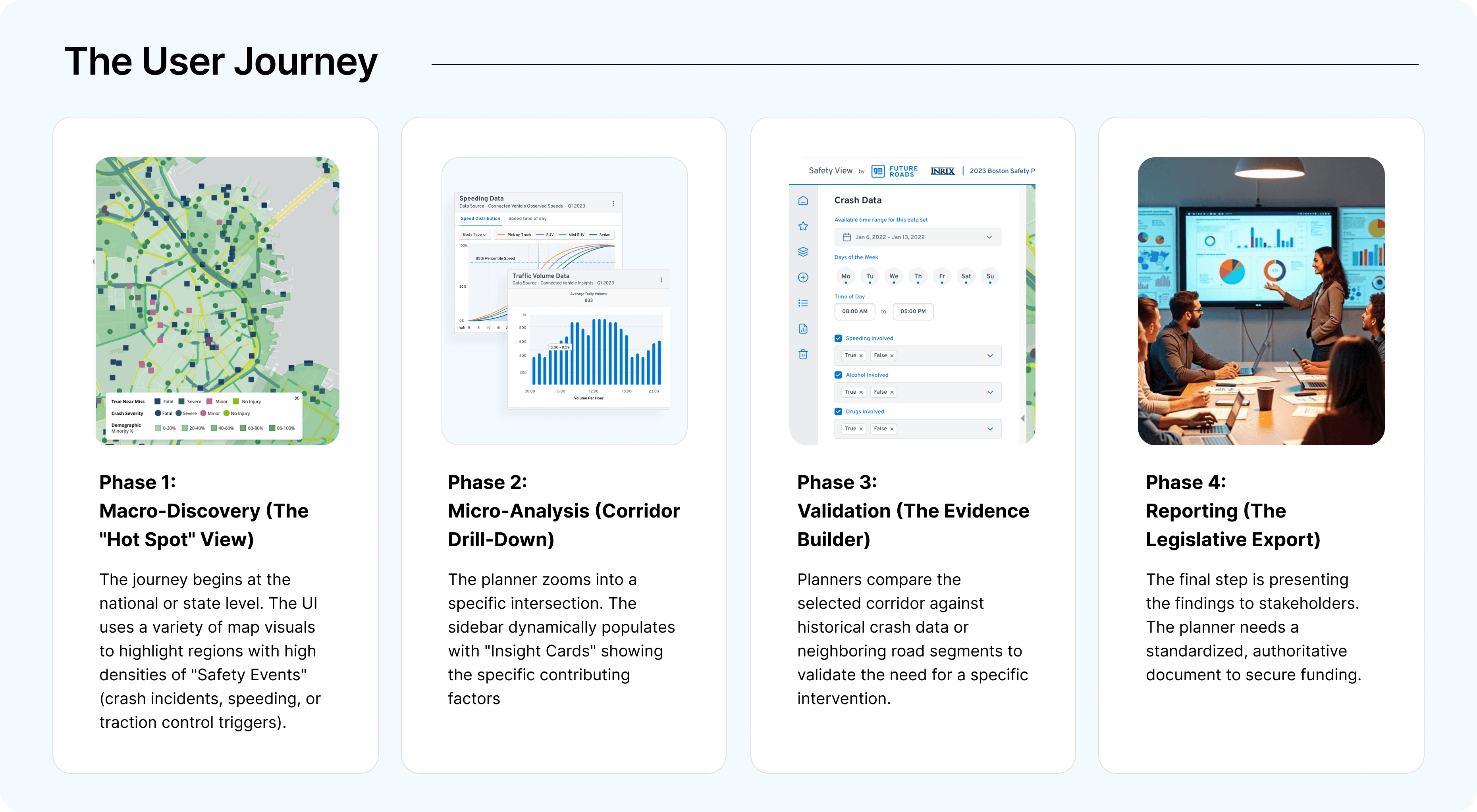
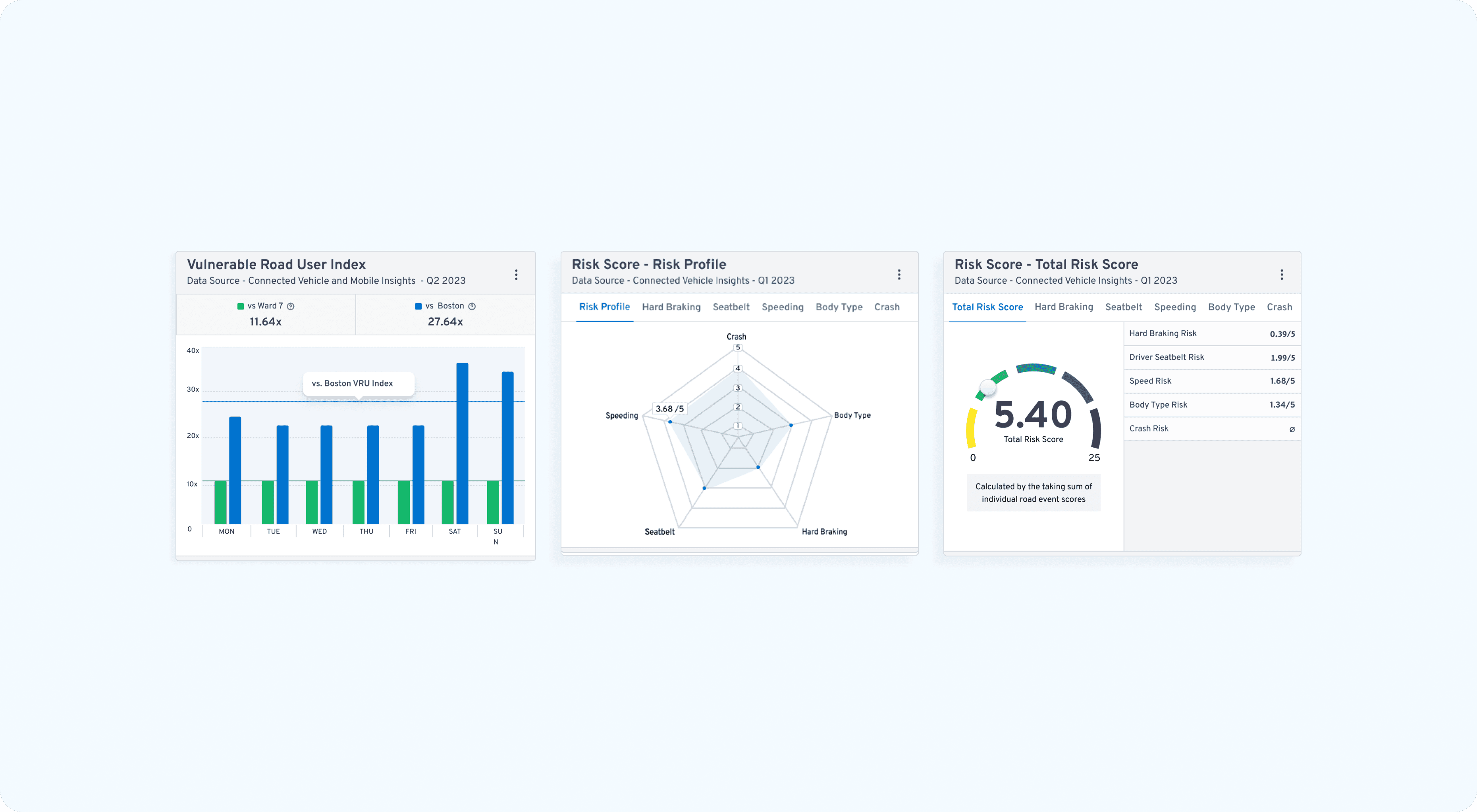
Proactive over Reactive: We shifted the platform's focus from historical crash reporting to predictive risk identification, allowing planners to see where accidents might happen based on near-miss data, risk scores and vulnerable road user index.
Unified Visual Language: By utilizing the GM Aurora Design System, we created a "clean-clinical" interface that provides high-contrast clarity for complex map overlays, ensuring credibility in high-stakes government environments.

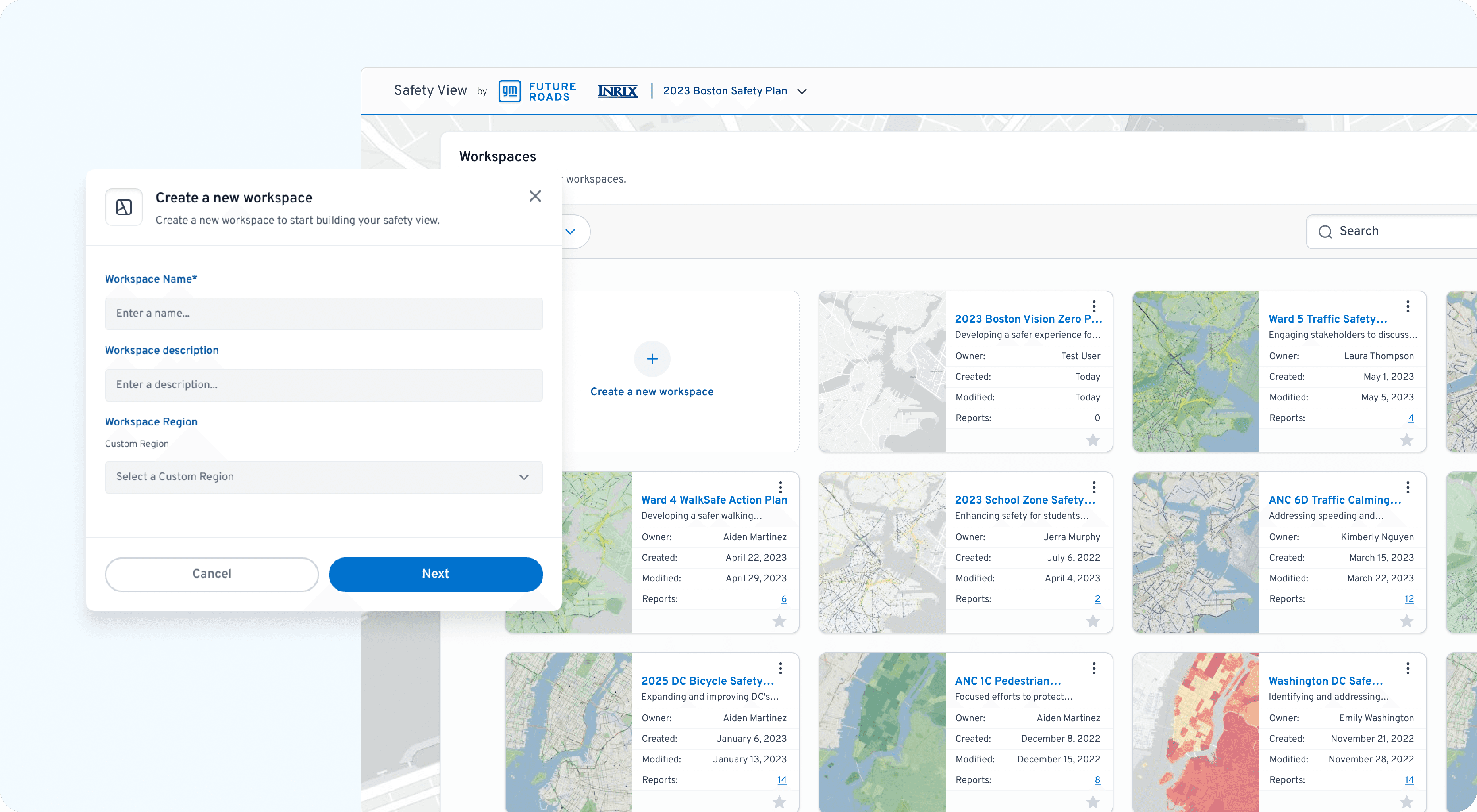
Flexible Workspaces: Users can organize their projects by creating custom workspaces for different types of safety studies. This helps planners keep their data tidy and focus on one specific analysis at a time.
Design Execution
To justify infrastructure spend, planners need to translate "dots on a map" into compelling safety narratives. I replaced dense, static tables with a Dynamic Layering System that allows analysts to correlate variables in real-time.
Unified Map Views: We connected different data sources to the same map, so all information stays in sync as you move around. This allows engineers to see exactly how things like weather and speed affect specific road sections at the same time.
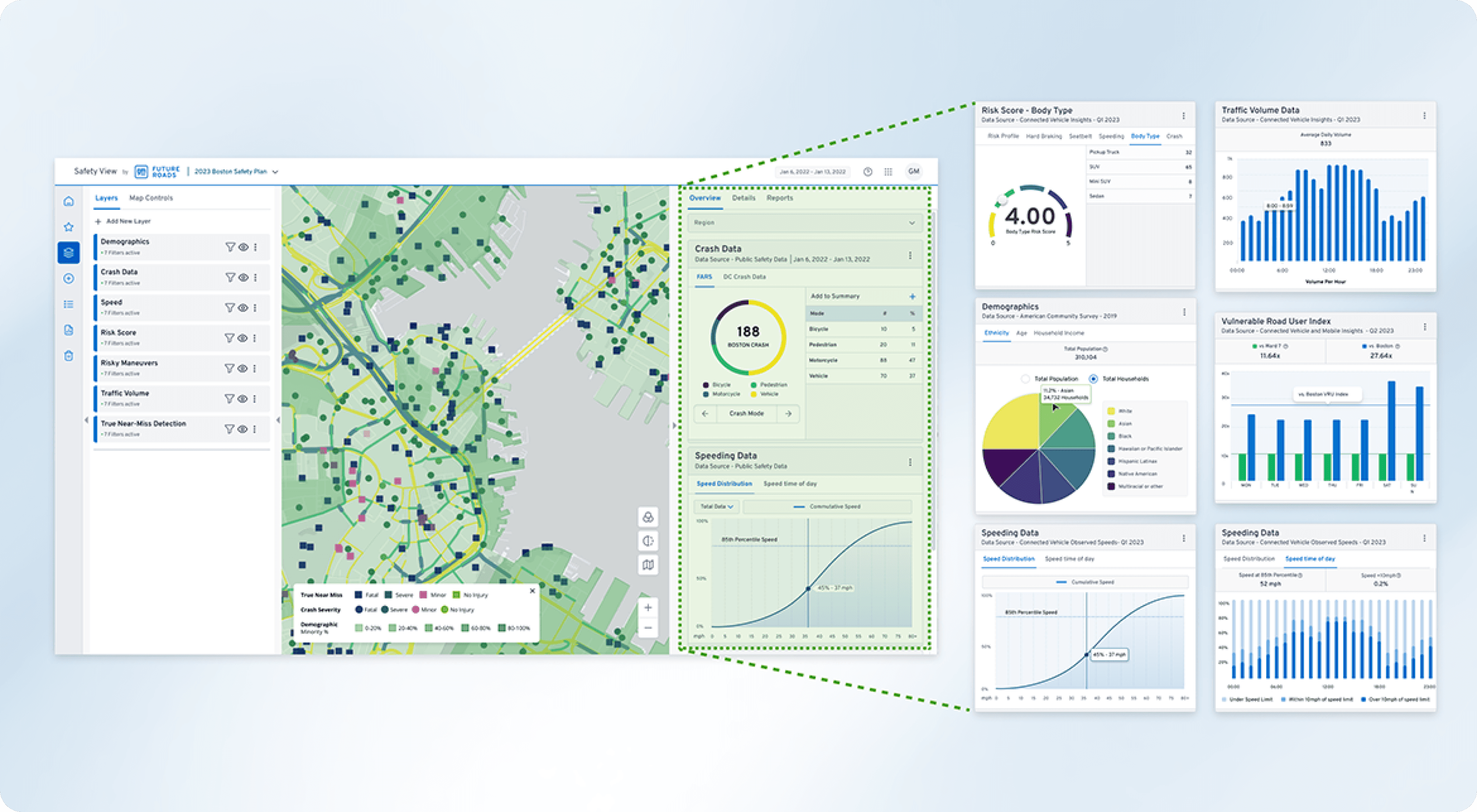
Contextual Filtering: Users can toggle "Insight Layers" (near-misses, speeding events, traffic volume) to isolate specific risk factors, turning abstract data into a localized safety audit.
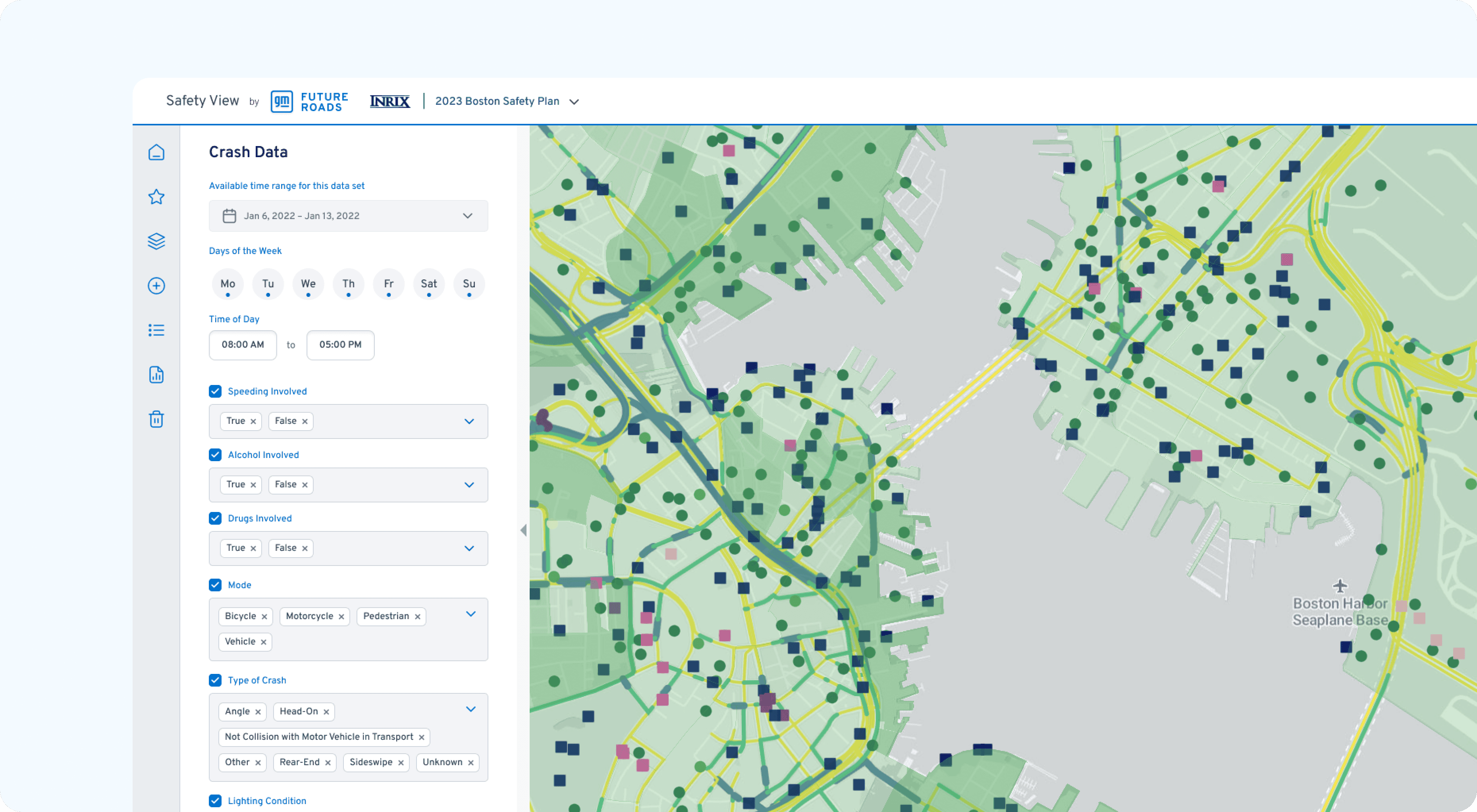
Detailed Corridor Analysis: Designed a side-by-side feature that allows planners to measure the projected impact of safety investments across different roadway segments.

The Impact
The GM Safety View V2 project demonstrates that for complex data platforms, design is the filter for truth. By transforming unstructured vehicle data into an intuitive visual language, we empowered transportation planners to make faster, more confident decisions that directly contribute to the goal of zero roadway fatalities.
42%
Faster Risk Identification
5
State DOT's onboarded
High
Data Fidelity
